YouTube, the largest video sharing website, is in the midst of a major makeover. The redesigning is aimed at simplifying the look and functionality of the video page. The new design of the video page is supposed to focus attention on the reason why users came to YouTube in the first place — the video. This new design also means a whole new navigation system. As it is a big change, the new design will definitely confuse users for a while.
Here are some reasons why you might like or hate the new design:
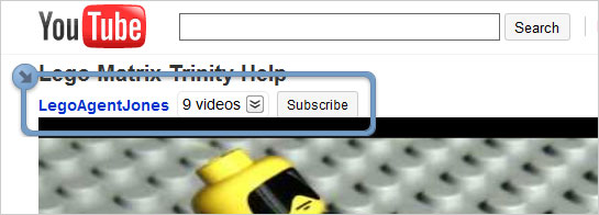
1. The username link, more videos from the same user, and Subscribe button now appear above the video.

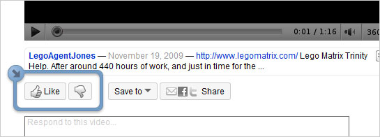
2. The five-star rating gone! It was replaced by a simpler “Like / Don’t Like” model. Below the video, you’ll be able to provide feedback by clicking on the Like or the Thumbs Down button.

3. The video’s description has now moved underneath the video. Clicking on the highlighted area brings up more video information, such as “Category” and “Tags”.

4. The video’s views are still prominent on the page. Clicking on the highlighted area brings up Insight, which includes stats, links, and honors associated with the video.

5. If you clicked on any video in a playlist, including recommendations, subscriptions, or the activity feed on the homepage, you will now see a new box on the upper right-hand side of the video. If “Autoplay” is turned on, the next video in the list will begin playing right when the current video ends.

See for yourself. Go watch some Lego Matrix, and let me know what you think.


I love watching videos online specially on Youtube. There are lots of music clips, movie clips and instructional videos on Youtube. I love em all.
I dislike the “like/don’t like” rating. Bring back the 5 star rating system!