You may think you need some fancy design skills to make a website but that’s not necessarily so. In many cases, less is more. A minimalist design may make it easier for both you and your visitors. These websites are simply designed but when done right, can really be awe-inspiring. Here are 15 minimalist web designs that we think you can model your new site after.
McKenna Jones

MacKenna Jones is a simple agency website that uses photography, large text and singular yet different color palettes for each page of their website. They do a great job in communicating what they’re about without any fuss.NEA

NEA uses a beautiful long form salesletter that is designed like an infographic. The graphical load ups that emerge as you scroll down is a nice touch that grabs your attention.Heco

Heco uses parallax design in a simple way. They shift their background design and small accents to add context to the various parts of their main page.Andfold

Andfold goes straight to the point by layout out their portfolio on their main page through large images. When you mouse over each image, you get a description of the project and can click in to get more details.Texas Thread

Who ever said you need a scrunched up design for an eCommerce site was wrong. Texas Thread uses large images and different background colors to highlight their small product line of T-shirts.Mansoor Fahmeed

This website is as simple as it gets but what makes it so unique is that scrolling takes you to a completely new part of the page. It’s set up like a vertical carousel so that the user is taken exactly to the portion of the page that needs to be seen.Metriculator

Metriculator demonstrates that minimalist design can often help simplify complex features of technical products. It breaks down the app function step-by-step with clear instructions, simple images and organized tables.Workweek

Workweek uses a sketch design and engaging yet simple fonts to grab the user and keep his attention. It is a great example of a minimalist sales page that you can use whenever you run out of ideas.Apple

Apple is known for embracing a minimalist design for their product pages and this one follows the theme perfectly. They use beautiful photography and power packed feature descriptions to sell the benefits of their product.ETQ Amsterdam

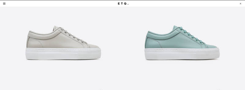
ETQ Amsterdam is another example of a great eCommerce site that uses large images over small catalog product displays. The only thing the user can do is hover over each picture to get the name of the product and click to learn more.Lecture in Progress

Lecture in Progress is a great example of what you can do for a blog. It uses a full page to display a large image and explain what the blog is about in one short headline. Once you scroll down, you’re greeted with blog posts arranged in a card-based design. It’s simple, impactful and user friendly.Square Space

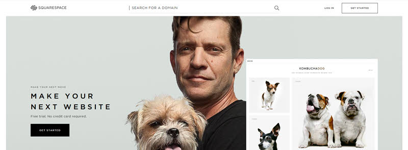
Square Space uses a large carousel that rotates to show how their different customers have used their product. Once you click on a specific customer, you are greeted with a popover that streams a short video. This is a great way to show different perspectives of your product without using a long form sales page.Maeemo

Maeemo is a renowned Nordic restaurant that uses breathtaking photography and visual storytelling to get its message across. It goes to show that using high quality images in a streamlined manner is all you need for a great design.Caleo Magazine

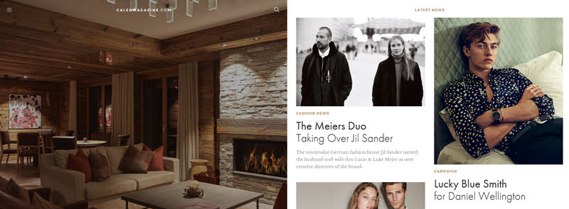
If you’re looking to make a website for a magazine, Caleo Magazine is the site to pay attention to. It features a cover story on the left half of the page. The editorials are on the right half and are organized in two columns that you can scroll down on. This really creates a magazine feel and allows the users to browse through the stories easily.Atlis

Atlis uses an interactive design that’s organized by leading questions to describe their app. There are no fancy graphics used. It’s all text boxes and images of the app that make up the design. The user can only go forward in one direction and they have to do so by clicking. This is a good thing as it gets the user to engage and pay attention to the presentation.
These 15 example should help you get started with your new site whether you’re creating a simply blog, eCommerce site, product site or professional services site. You can do just about anything with a minimalist design. What makes a minimalist web design work is often the quality of the images or the uniqueness of your design. So make sure you put a lot of thought into how to make your site stand out through the simple design as that makes all the difference.
Photo: unsplash/@veeterzy

