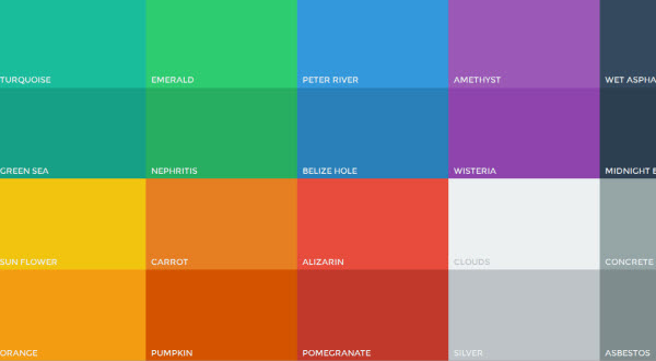
When referring to non verbal communication, colors are highly important as a medium that is used for conversation purposes. Colors will convey meanings and messages in an effective manner. They shape emotions and thoughts and will have a really big impact on personal buying habits. This is the main reason why you see ads that are so colourful these days. It was proven that a modification in buying decision can appear of up to 80% in online shopping, which is definitely a lot more than you could ignore.
All professional Sydney web designers understand the fact that their job is important. They learn all that they can about the psychology of marketing so they easily use all the options that they can in order to create a proper online appearance for the business that you own.
Colors will help the site owner to create a site that is truly perfect for business. Color spectrum needs to be based on warmer colors that are close to red and cooler colors that are more towards blue. Besides these two, we have colors that help out a lot in portraying a special feeling. For instance, you will surely realize fast that blue is used in the logos of various trusted companies. That is because the color inspires trust. Orange shown in a combination with yellow and red will portray creativity and fun, offering a light hearted design. Such examples highlight the importance of colors.


When thinking about web design, color combinations are vital as they would create an impact in the customer’s subconscious. You always want that. We, as human beings, trust the non verbal indicators since they would influence our buying decisions. Appealing color combination is very important for the proper design, the one that helps in getting more clients for a service/product.
Colors have to be chosen really careful because one color has a specific meaning for the web designer. Think about the colors that you choose for everything, like background, hover, texts, links and even white space. All the colors utilized have to perfectly complement each other. It is always a really good idea that you avoid using too much white or too much black. When using these two in combinations or alternatively using shades with just small smudges of other colors can create an effect that would be highly beneficial for your company.
Red is particularly popular as it is eye catching. Normally you will see the color in advertisements and text but red usage that is too high, the design’s success would not be that great. Contrast is thus highly important as we have to obtain an after effect that is proper.
We should also understand the fact that there are combinations that are completely displeasing. For instance, green and purple would spoil overall web design. You have to always avoid combining lighter colors with white and darker colors with black. Eye strain is created when this happens and the customers will most likely not have all the patience that is necessary to browse through the site that has content that is hard to see.

